Web design is like any other creative industry and has trends and fashions that come and go with the seasons.
Unlike the fashion industry we don’t all change our website designs every spring, but web design trends change every few years and every eighteen months or so there is a new idea that strikes us all as amazingly innovative. Let’s have a look a half a dozen of the latest web design trends.
1. Web Fonts

The use of common web fonts in web design has changed dramatically over the past few years. Partly because of the introduction of Google Fonts designers are no longer stuck with Ariel or the dreaded Comic Sans to deal with compatibility issues as Matthew Mombrea says in his article about trends for 2016 and 2017. This has led to a flourishing of fonts used in web design. An increasingly popular choice is fonts in the style of handwriting and this does add a modern and personal touch to a website. When using different styles of fonts on your new website be careful not to go wild as too many different fonts can be confusing for the user and difficult to read. Also be aware of the dangers of viewers accessibility needs and make sure any font you use is easy to read. No one wants to lose a customer because they couldn’t make out what that all important message actually says. The awwwards.com blog has an interesting article that discusses some of the disadvantages of many design ideas including fonts.
2. Colour Usage
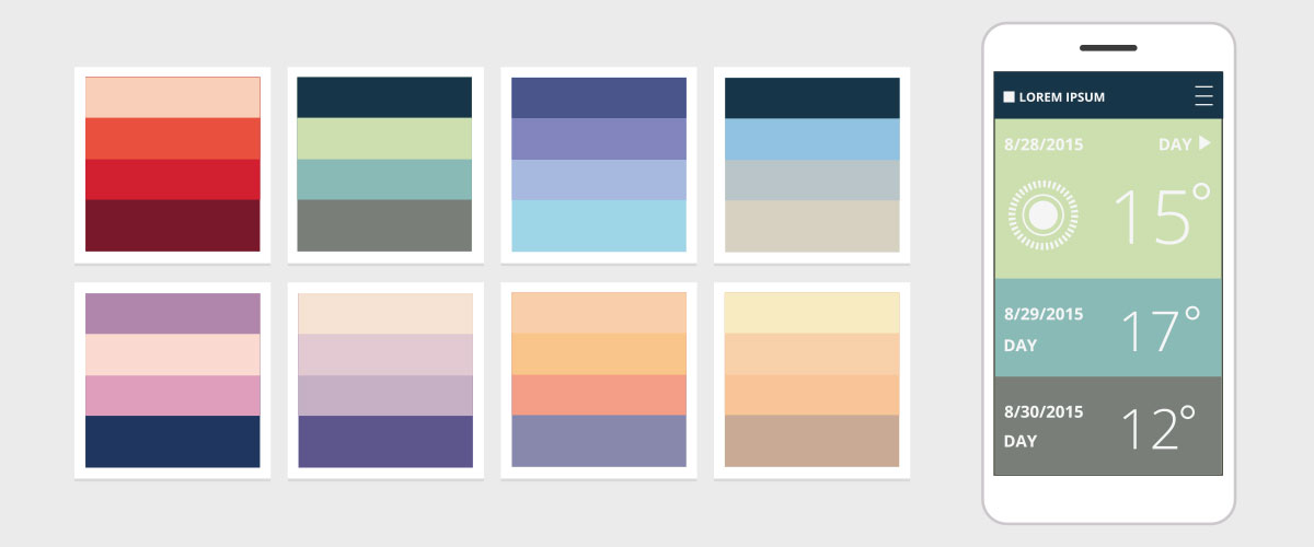
Colour usage in web design is where you can really tell when a website was designed. The current trend for pastel colours stretches across all forms of design, from fashion, interior design and now to web design as well. But there are a few points to consider before changing everything to pale tones. Monochromatic schemes involving bright and bold colours are inventive and exciting as is the idea of block colouring. These ideas can lend an interesting and attention grabbing look to your web design. Have a look at the interesting article by Jerry Cao on colour design tips. Again accessibility can be an issue as some colour combinations can be hard to read and there are lots of combinations to avoid such as neons with neons and light colours on a light backgrounds. Carrie Cousins has also written an interesting article about colour combinations to avoid and it is well worth a read.
3. Increasing Originality
Everyone would like to think that their web design is original and unique. One way to ensure that no one else has anything similar is to design a short animation or as many are calling them ‘micro-interactions’ or ‘micro-experiences’. Or in other words a short animation or movement guiding a user to a call to action and they can be a different way of drawing a viewer’s attention. Unfortunately these animations can affect download times, especially with mobile devices and it can also affect the SEO of a website as search engines cannot scrape them for data. Have a look at Matthew Mombrea’s article for a guide to the upcoming trends with increasing originality in web design.
4. Personalisation
Everyone is familiar with the increasing personalisation of the user’s experience and Amazon and Pinterest are are prime examples of this. Web users are becoming familiar with the idea of swapping of personal data for a more customised experience. This goes hand in hand with the ever expanding importance of social commentary for many businesses. Ensuring website’s users data privacy, monitoring and commenting on social media posts have become essential good business practice. Timothy Kolke in his article provides a few simple rules to follow to ensure a business can build customer satisfaction and brand loyalty. These include making sure users understand they are exchanging information, making sure this exchange is a fair deal and give users control of their data.
5. Mobile Based Design
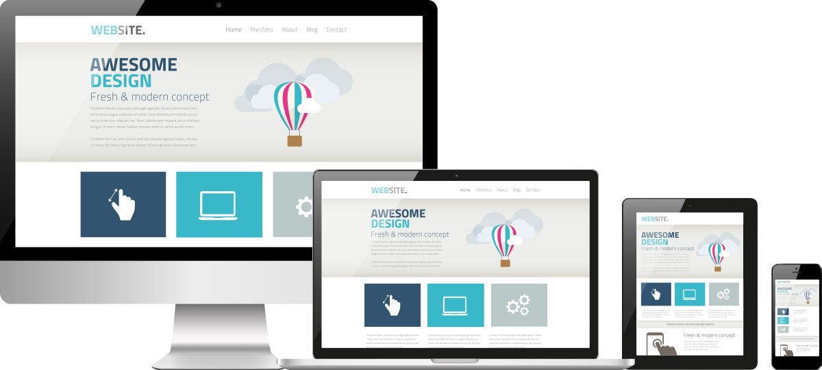
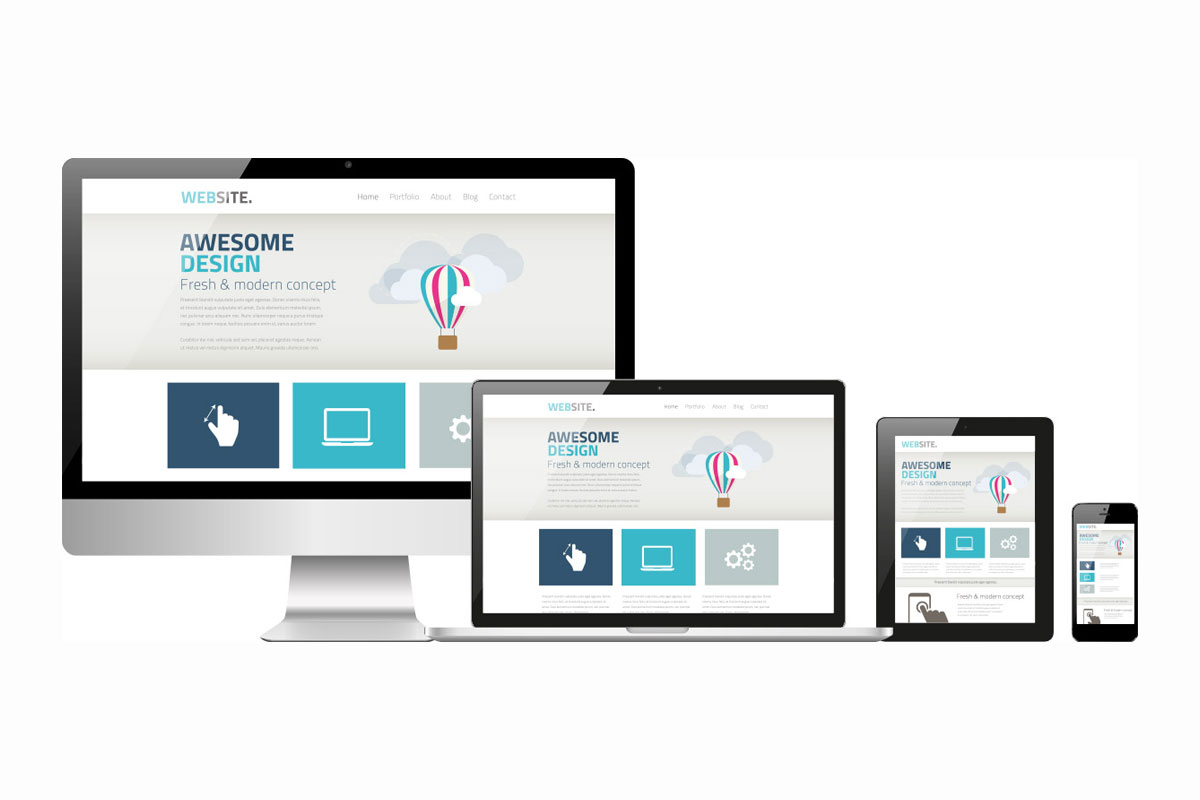
Mobile based design has now been around for some time and it comes as no surprise that accessing the web via mobile devices seems to be ever increasing. In many countries, accessing the web via mobile devices is the most common way and many new design trends have this in mind. Keeping in touch with mobile web design trends is as important as ever. As discussed above with the trends in colour usage monochromatic and block colouring designs all have the simpler needs of smaller screens in mind. This has also lead to an increasing minimalism in web design.
6. Old-Fashioned Design Ideas

There are some web design trends that many people had thought were on their way out, but are proving to be useful in a different and innovative way. QR Codes were a bit of a novelty when they first came out, but suffered from a lack of real purpose. In Jacob Cass’s article he explains that in China QR codes are scanned from the screen of a computer to give access to mobile content such as wallpaper and music. He also predicts a return of the split screen as it is so useful for e-commerce sites. Perhaps, some of the more old-fashioned design ideas still have plenty to give.
So, keeping an eye on the latest modern web design trends and also keeping an eye on those great ideas from the past makes sure that we keep the best of the old and the new. By keeping the user at the centre of the design process this will lead to a businesses website building brand loyalty and customer satisfaction and this is one of the most important reasons websites are designed in the first place.

